Composition in portrait photography

Recently, one of my oldest friends and favorite sources of feedback asked me for advice regarding image composition and boom, new idea for an article was born. He was interested in how I approach a picture and what thoughts I have before I press the shutter button. My first impulse was “none at all“? Or rather, I work on a more spontaneous, intuitive level.
Nevertheless, this was still going through my head during the next shoot and while I was taking the pictures, I paid a little attention to why I’m doing them the way I do them. And voilà, there are actually thoughts behind an image, quite a lot in fact.
Composition in general
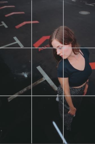
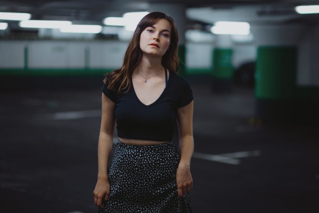
So an underground car parking lot is certainly not an everyday example for most photographers, but it is still an exciting challenge for portrait photos. In addition, underground car parks or their above-ground relatives have a great atmosphere.
But why this location for image composition?
First of all, it does offer wide spaces with lines in a nice symmetry and that just goes great with portrait photography and creates many opportunities to think about composition! In addition, especially multistory car parks have real charm, especially in the evening sun, and underground car parks have a really atmospheric flair (at any time of the day). Caution though: Of course, for commercial photos, you need the permission of the owner.
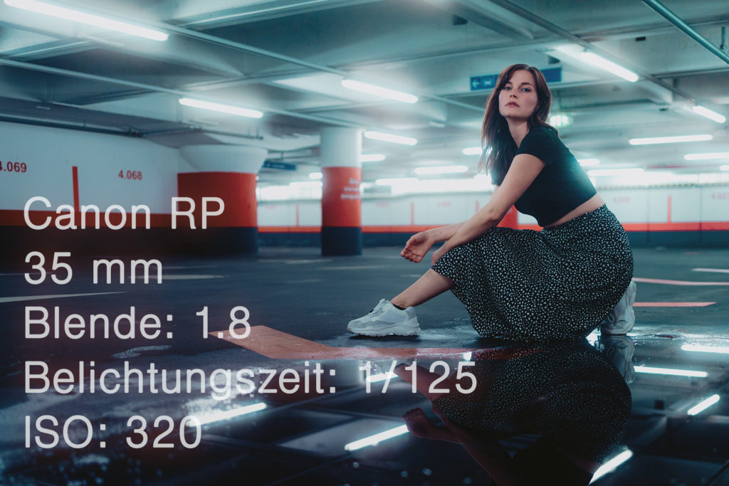
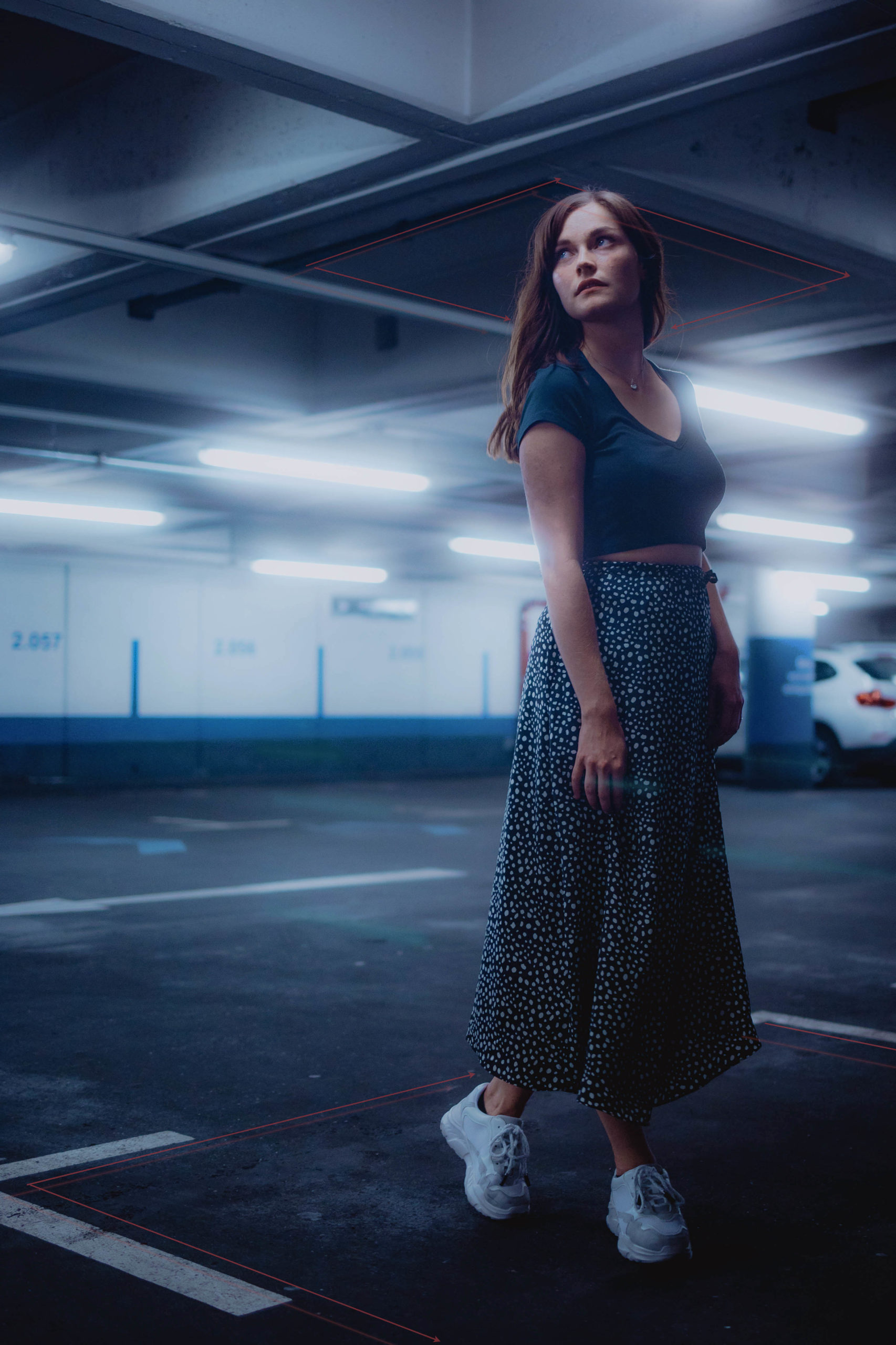
When Anna and I had already walked three floors deep into the garage, we reached a level that was not only completely car-free, but also offered a water surface.
When I see spots like this, it’s often a trial and error process: I know I can take a fantastic photo, but I still have to figure out the right angle, perspective, pose, lens. I’ll manage to take the shoot at some point, but I rarely have the picture in mind, right when I arrive.
In photography, one should generally not give up too early, change the height, perspective and especially the light (sometimes from the front, sometimes from behind), try and see what comes out of it.
It worked for the photo below and above, even if the skirt suffered, but why does this image work?
Leading lines: Guide the viewer

Guidelines are very present in the theory of photography and even if you have never read anything about them, many photographers are already subconsciously paying attention to them. Because even if we can’t explain it, photos with attractive lines unconsciously speak to us more.
In this photo are some examples of such guidelines, with the lights on the ceiling reflecting in the water, the arrows on the floor, and the straight line from the wall painting.
And just to reiterate, the picture isn’t something that just comes to me. I’m not at the location and I know immediately how and where to photograph, it’s just a matter of practice, and it’s worth it, because over time it becomes easier to see guidelines and work with them.
Very important here, if you are stuck at a location while looking for exciting picture compositions, always stay positive; Your model needs to enjoy the whole process, and you can’t do that if you’re frustrated or unsure. Of course, you can always practice in street or architecture.
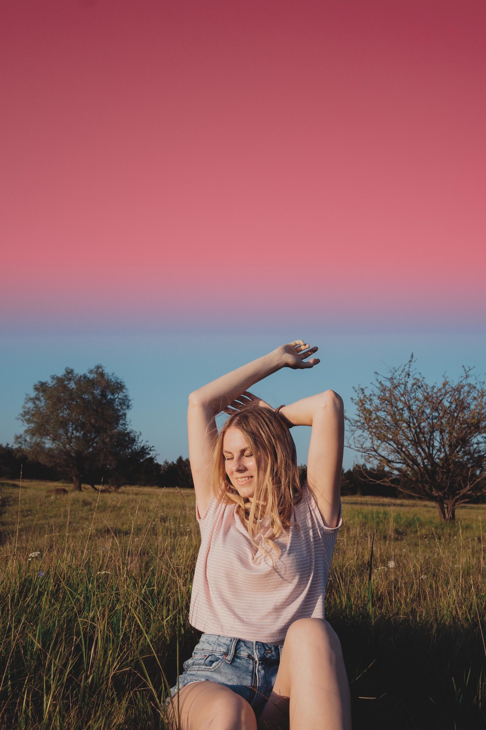
Symmetry is not everything
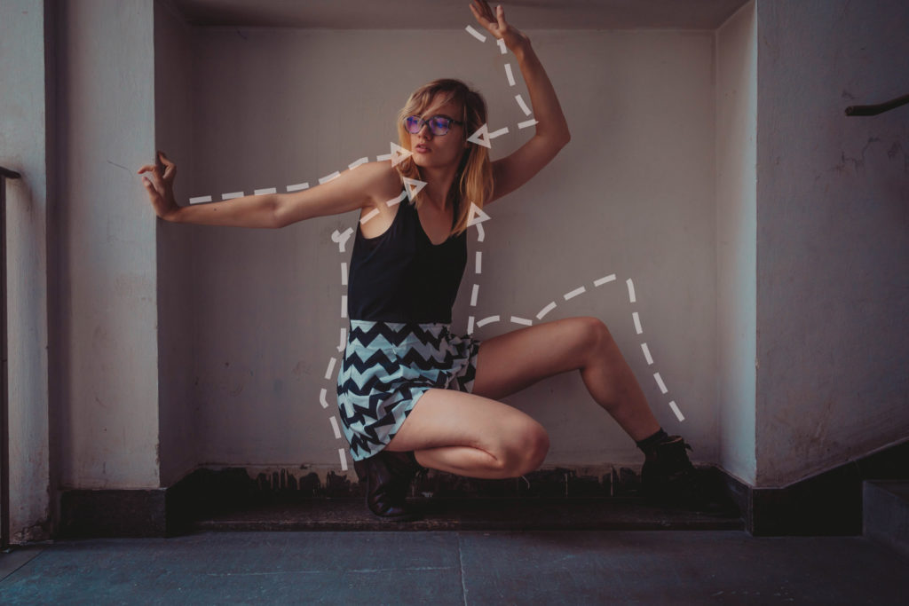
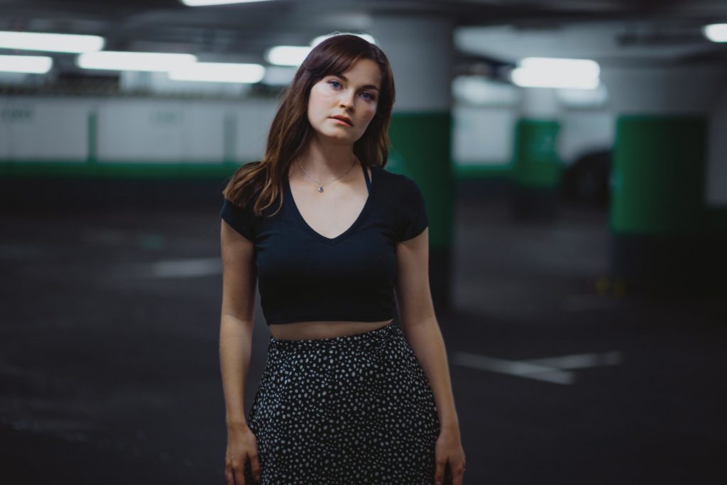
Guidelines do not always have to be found in the environment. Sometimes it is enough to have a model who simply does the tedious task for you. In frame Annie.
Guidelines do not always have to have symmetrical shapes, as can be clearly seen in the previous image. To be honest, sometimes unusually guidelines maybe better… For me, I find normal guidelines more and more boring and exceptions with unusual lines tend to fascinate me.
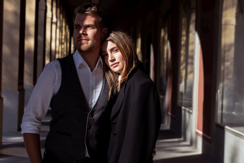
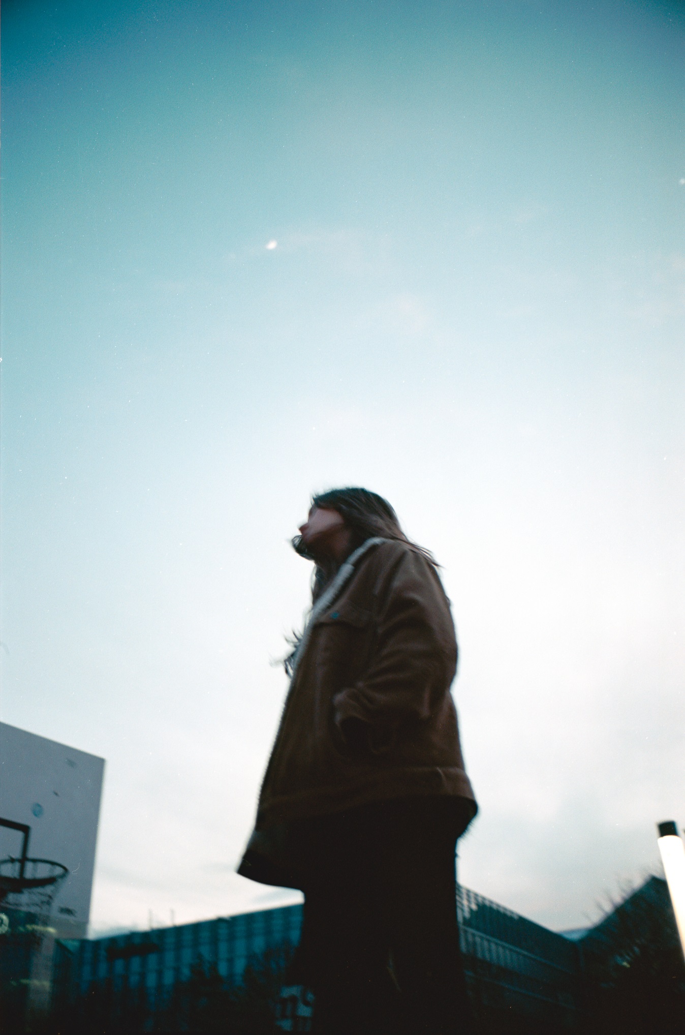
A typical example of more classic guidelines that no longer really knock anyone’s socks off is the passage of the Hofgarten in Munich. Of course, I don’t want to badmouth the location, after all it is and remains a great background for portraits. It’s just not that exciting to look at anymore.
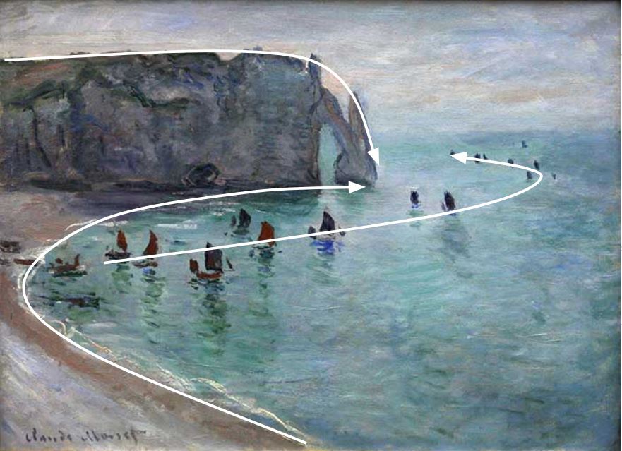
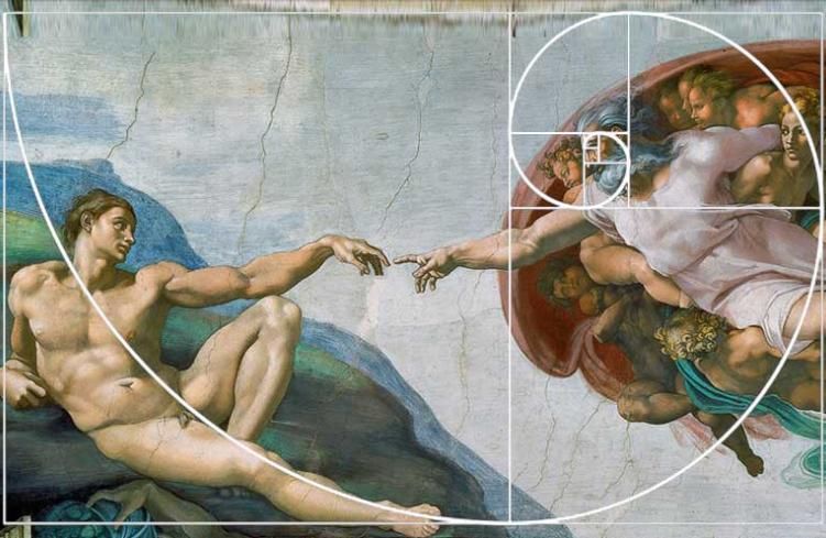
Of course, guiding lines is by no means an invention of photographers. It’s very, very old: In landscape painting in particular, one often finds more complex lines in the composition in frame. Here is an example of art by the painter Claude Monet at the end of the 18th century.
Other examples:

Next: Golden ratio and the rule of three

There are books that only deal with the analysis of the golden ratio and its importance for the composition of the picture. Because of that, and because I’ve never read any of those books… I want to keep it as short as possible. The bottom line of the golden ratio in photography is that it is easier on the eye when the main subject is not placed directly in the center of the frame, and we can learn a lot about composition from that. Example:
This composition is easier on the eye than a centered subject, in theory. In practice, this means that when you take a picture, you compose the photo so that there are enough interesting elements in the other two-thirds of the picture.
By the way, I don’t always manage to hit the golden ratio perfectly, and I often forget it. So it’s definitely helpful if you have either experience or a camera that delivers such good quality that you can crop it correctly afterwards. For me, analogue photography is the best way to improve your composition skills, since you actually can’t crop everything afterwards and have to take much for attention when you frame your subject.
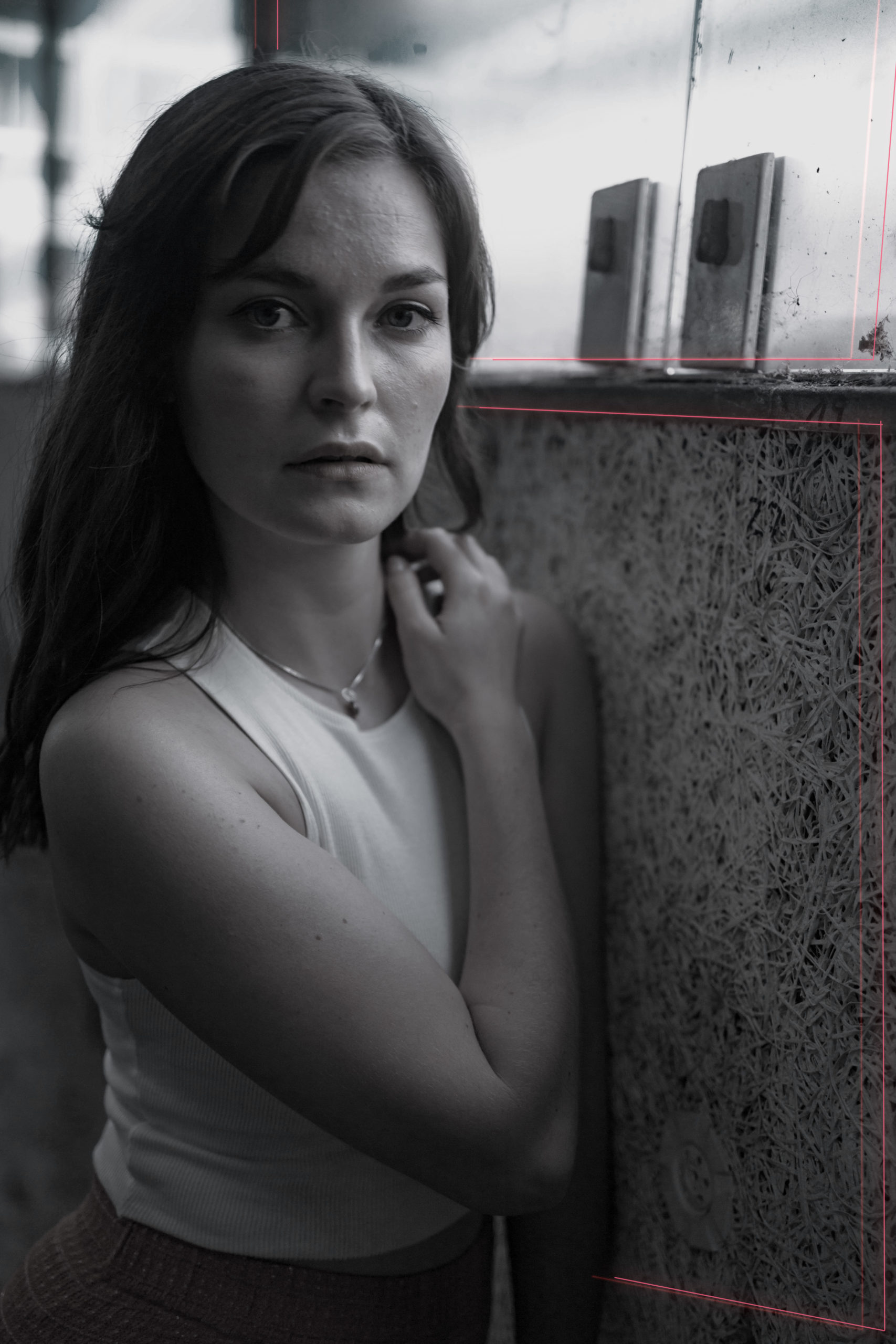
Let’s come back to this picture and my problem described above; with this crop, I don’t really know where to look.
I see two reasons for that. On the one hand, our eyes generally first wander to the brightest point of a picture, and in this case, this would be the lamps in the upper right corner of the frame. On the other hand, the red floor markings distract from the model.
This can be fixed by image editing, especially black and white.
Lets get personal: My opinion on black and white
I think black and white photography is misunderstood a lot these days because a lot of photographers use it as a means to make a picture look more professional – borrowing from great photographers like Peter Lindbergh or Manuel Schnell – to mimic a certain look. However, few understand that black and white is more than a look that automatically makes everything look more pro and chic: Black and white can also make photos look significantly worse.
I almost never use B/W because to me, colors almost always add a bit more character or information to an image than B/W does. There are three exceptions where I prefer b/w:
- Too many colors, elements, or contrast distract from a main subject (the image is too overloaded)
- The exact opposite of this: The image is too still and I want to give more importance to one aspect of the image (usually the brightest) with B&W
- Or I want to draw the viewer’s attention to details and want them to look at the picture for a longer period of time; Incidentally, we unconsciously look at B/W pictures a little longer (our brain can usually process the content of the picture faster with color)
Examples where BnW works:

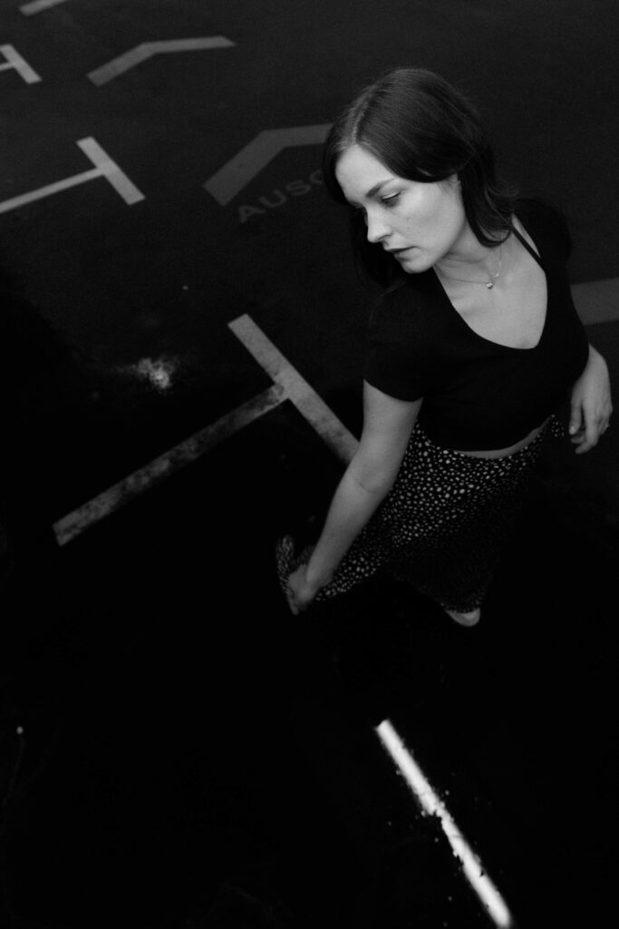
The image from the same scene of Anna looks much better in BnW because the colors distracted from the simple composition. The image and focus is now very much on her expression and movement. Above all, the orange arrows on the ground or the dark puddle no longer catch your eye. Instead, the face is clearly the star of the shot.
With the picture on the left, on the other hand, I can use black and white to draw attention to expression, skin pores, soil textures and not let my viewers be distracted by “annoying” colors. In contrast to the picture of Anna, there was too much to discover in the picture, which distracts from the main subject.
Back to the original topic. Incidentally, Leonardo da Vinci was famous for the golden ratio in his paintings.
Use the back- and foreground: 2 becomes 3D
It’s been years since I met the photographer Anna-Lena Duschl for a coffee and got her feedback on my pictures at the time. “Foreground makes the picture healthy” was one of those aha sentences, of which she gave me a few.

That doesn’t necessarily mean that you have to place something in the foreground no matter what. However, the fact is that when our eyes perceive a foreground and background, the image inevitably gains depth and thus appears “realer” because it gives our eyes a spatial understanding.
The art of framing your subject
Framing is easy to explain, because you can visualize it very well. Simply put, it is about setting a frame around your motiv. This is not only more pleasing to the eye, but, like linework or the golden ratio, can help the viewer to recognize what or who the picture is about.
A frame does not have to be square. It can also be a reflection in a car mirror, a face entwined in a bush, or just about anything that you have around your model or eye-catcher. Also, the elements do not necessarily have to be on one level. Details in the foreground or background can also be used to successfully frame. Here is an example from photographer Sebastian Lentner:

There are no limits to your imagination when it comes to framing, and if you need inspiration, you can find creative examples on the Internet or Pinterest.
Most of the time, good framing is more noticeable to the trained eye, while the unskilled viewer simply finds it very beautiful without knowing why. However, this is no different with bad framing… This unconsciously disturbs even someone who has not dealt with the subject at all.

Instead:
Portrait tip: Limbs belong in the picture
Sure: hand to toe everything from the model in the picture is not a general rule BUT I’ve had many shots where a hand or foot not in the frame made a big difference.
One option, if you don’t have hands or legs in the picture, is to crop the frame so that the focus is not on what’s missing but on what’s there.

Another way to avoid this, as banal as it sounds, is to have enough photos to choose from. In other words: take enough pictures of the same scene in different poses and at different heights, viewing angles, and then switch to one where “everything is right” with the picture composition. I’ve to mention it again here, that’s not an option for film photographers, which is why I recommend using film to improve your photography skills, because mistakes hurt a lot more and that’s one way to learn to avoid those in the future.
Portrait tip #2: Avoid “negative” space in the picture
“Negative space” means space that contributes nothing to the composition of the image and merely distracts from the subject. A typical example of this is too much sky (marked red in the image, very subtle I know):
Often something is missing in an image composition with too much empty, negative space in it and even if you can frame it a little better in post-production, you still lose image quality in the end. That’s why, when taking the picture, think about what you need in the picture and what you just cut away later anyway.
But be careful: Negative image areas don’t have to be wrong, they can also be used as a stylistic device in the composition of the image. Especially when you want to go in an artistic direction.
Do you think about all this when taking a picturte?
Short answer: NO! I wouldn’t get to take any pictures if I had so many factors in my head each time I pressed the shutter button. Also, I would lose a lot of fun in the whole process.
Let alone getting involved with the model or being able to react flexibly. Rather, I either shoot by intuition or simply make enough pictures from different perspectives and angles. What helps with that is of course being able to use the manual mode of your camera beforehand to be honest.
But: At some point I dealt with the individual aspects of the composition of the picture. Definitely not all at once, but little by little. In addition, I often had them in the back of my mind during the learning phase and sometimes also switched on diagrams on my camera screen so that I had an easier overview of the image structure.
Speaking of camera tech, setting the camera to black and white can definitely help, so you’re less distracted by colors and more focused on composition. Just remember to shoot in RAW, otherwise you’ll never get the colors back if you save in JPEG format.
Lastly, dont take this all too serious

I know, what was all that stuff then, but still: Rules are there to be broken. And that’s especially true for the rules in this article, especially in terms of composition.
Of course it makes sense to learn, internalize and understand them – but please don’t get stuck on it!
Strictly following the rules of photography can suck the fun out of the craft. Sometimes taking pictures freely, turning off your head, giving a damn about picture compositions and technical perfection and just having a lot of fun is much more valuable than always delivering a technically perfect picture. Additionally, as a photographer, delivering a good picture is at least as important as being able to shoot at the right moment.
Therefore, rules or not, make your style, make it unique, creative and free: learn the rules, learn the composition. Internalize them, so you understand why photography looks the way it does, take what makes sense with you, and then pull through with your style anyway.
Speaking of breaking the rules, you can take great portraits in a parking lot but also, completely opposite, in the harsh mid sun.